For 30 years, the Chatsworth division of Nature's Gate has been working on the development of personal care products with phytotherapeutics. Feedback from retailers and consumer groups shows that the company's Fruit Blend product label "Organics" does not express clearly the features, characteristics, and benefits of each product. Therefore, Nature believes that it is time to improve the packaging.

“They found it difficult to distinguish between different product categories (such as shampoos, conditioners, care products, shower gels, etc.) or how to choose the right product based on different hair types and skin types,†Nature's Gate’s market Deputy Director Laura Setzfand said, “The content of the plant textures and colors involved in the product's main ingredients and aroma are illegible, and a single-color label design cannot produce a good shelf display effect.â€
“We also want to let consumers and retailers know that through packaging, we can understand that the efficacy of Fruit Blend and Herbal Blend is completely different.†She added, “Fruit Blend series can prevent fading and yellowing of dyed hair. Or protect the skin from environmental damage and aging, and Herbal Blend is suitable for members of the entire family who have different hair types and skin types.â€
As a result, Nature's Gate decided to design a better-informed, more compelling package for their products to attract consumers and guide them in understanding the brand, thereby promoting product sales. "We changed the previous single-color silk-net-printed bottle into a bottle labeled with eight colors, and the cost of the material increased," Setzfand said. "However, using labels to get our materials in and out The goods are more flexible, and more importantly, our delivery cycle is also greatly shortened. We hope that this increase in the cost of raw materials can be bridged in terms of product sales and operational convenience."
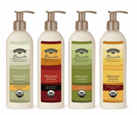
The changed tags have larger fonts, better graphics, and pedagogues that better embody the product's positioning and are produced by Tri-Print LLC. “We worked closely with Tri-Print to create labels with good shelf presence,†explains Setzfand. “Previous packaging designs focused on the bottle body and the label as a background. This was done to better provide explanations.†The purpose of the information, not to attract the eye. And for the new design, we hope not to change the color of the bottle that has become the common features of the Herbal Blend and Fruit Blend series, and make the label become the focus of attention."
This poses a challenge for Tri-Print. They tried a lot of different methods and techniques to ensure that the patterns and colors on the printed labels were in sharp contrast with the color of the bottles. They also added an opaque yellow liner between the bottle and the label, which required the trim of the liner to be just right. The new label began appearing on the market in 2008 and is expected to be used on all related products in the near future.
Setzfand said that their investment in new labels has paid off. “Our dealers were pleasantly surprised by the changes in the appearance of the product and the sales of the products have also achieved good results,†she said. “The new packaging also allows our products to be sold in more places.â€
More cosmetic bottle content please pay attention --- cosmetic bottle channel
Reproduced, please read: Please contact our site for consent before each reprint!
The one way of car washing is two buckets , that can save water. The design of bucket to avoide scratch of car paint during work cause of grit guard, you still can wash polisher pads too. The spare parts included cover, grit guard, dolly, bucket, washer.
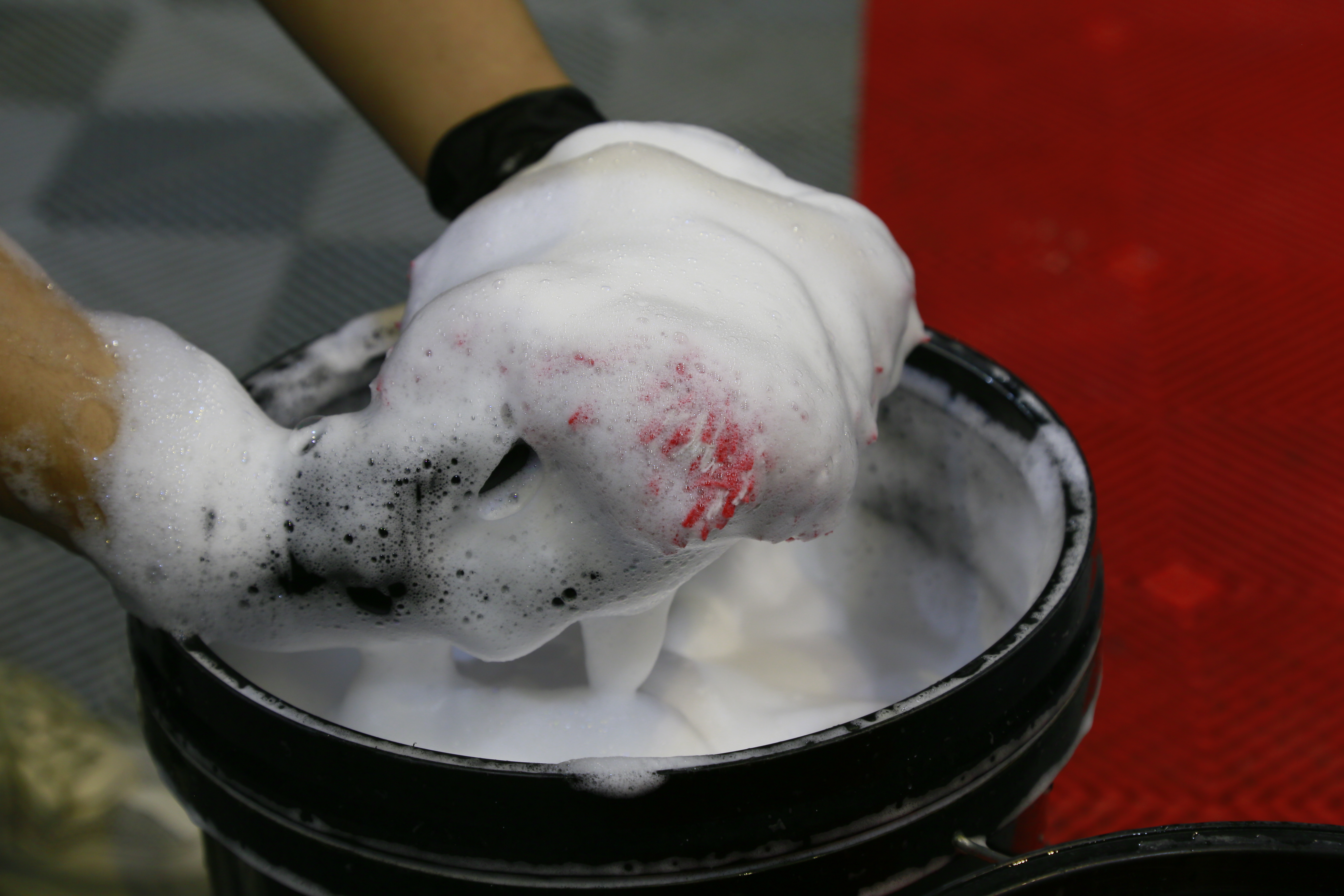
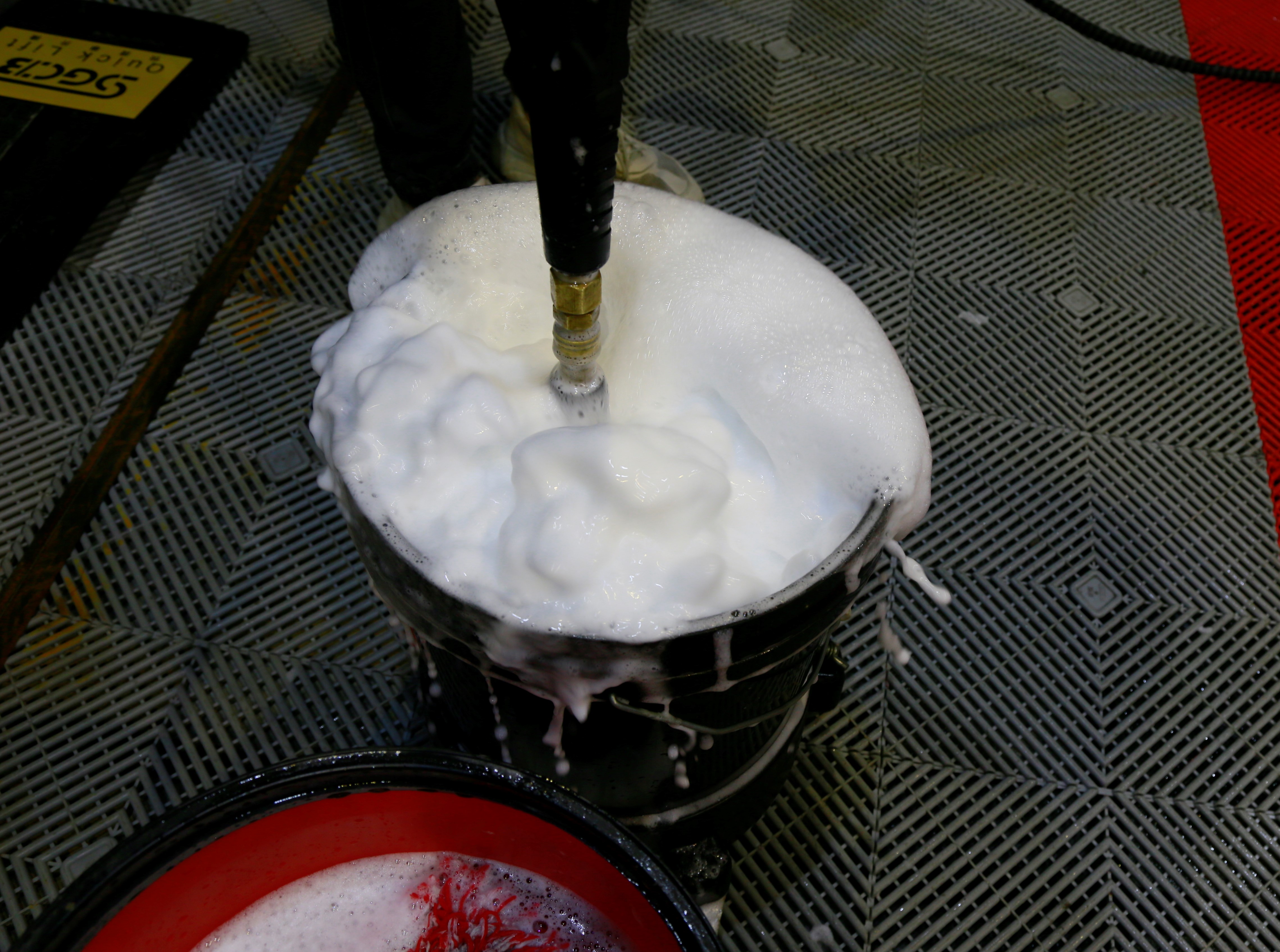
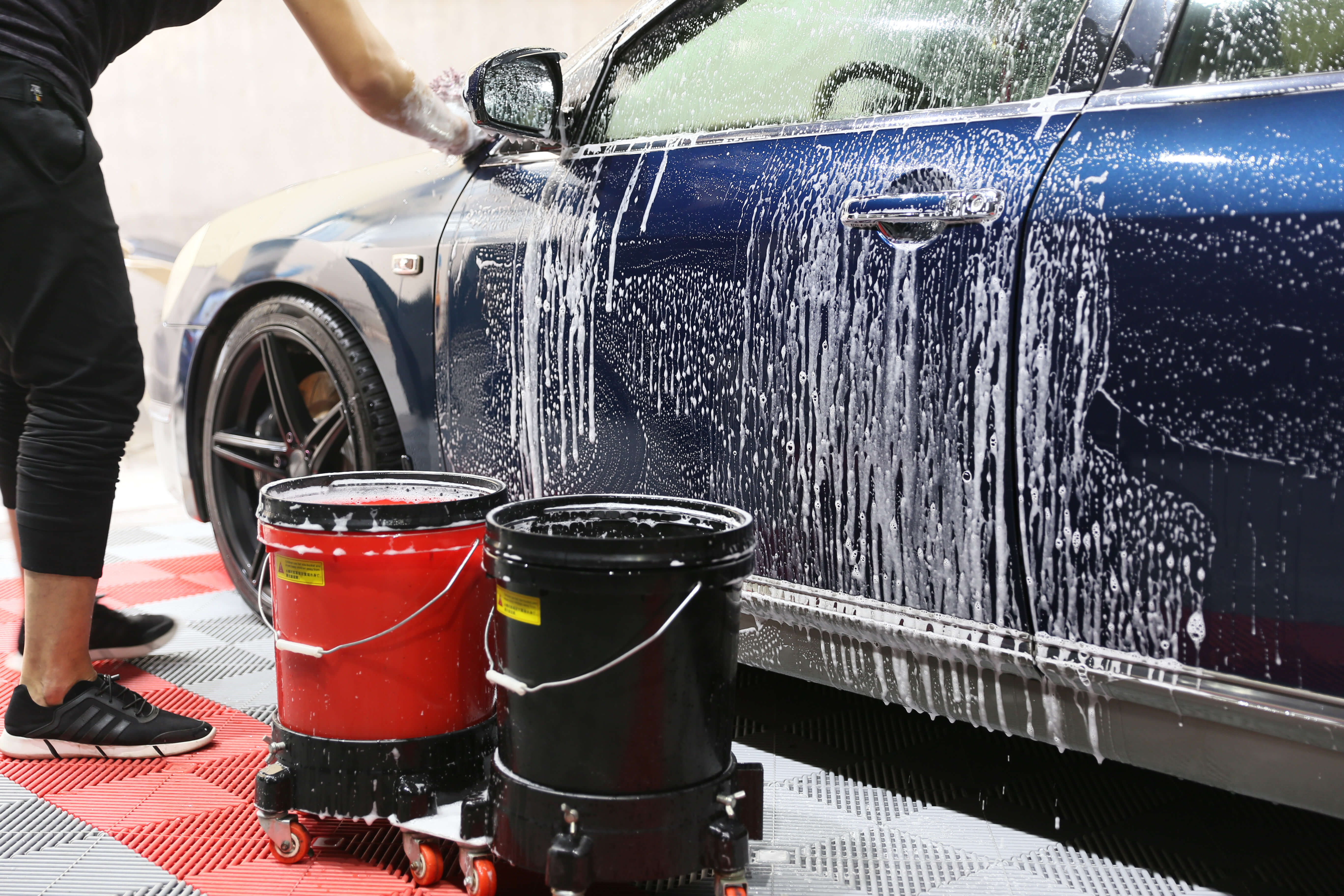

If you wanna know more about it , pls contact with us.
Best Car Washing Supplies,Car Wash Bucket,Car Wash Bucket Kit,Car Wash Bucket With Grit Guard,Car Wash Two Bucket Method
SGCB COMPANY LIMITED , https://www.sgcbautocare.com